I recently swapped manuscripts for critique purposes and got
some great feedback on The Seventh City.
I wish I’d found this reviewer before
submitting my novel. Oh well. I'll post that story sometime soon. Anyway, I made changes where I felt she was spot
on because why settle for less when it's an
improvement? Most were little things like clarifications. Today I’m sharing one of the
bigger fixes with you.
I had two close in proximity scenes where Karlinah speaks with her
father, King Lamoni. The critiquer suggested I combine these so it doesn't feel
like the story goes back and forth. It would improve the pacing, better advancing
the story. This sounded like a good idea. TIP: Sometimes writers just need to try scenes in a different order. Especially since I was lucky enough to have it pointed out to me. I analyzed these scenes with
the surrounding ones to see why I had placed them apart. The only thing I figured was that I was focusing on one subject at a time or I just had it in my head that way. Combining one venue with the same characters would make my story better.
Analyzing caused me to discover that I also had two scenes where the MC speaks
with the slimy High Priest. This time I knew why I had separated these. I
wanted readers introduced to the HP before the second discussion so the
audience would already know he is creepy. Combining the previously mentioned scenes with the king affected
this split of speaking with the priest. I should combine those as well and see
the result. Check. Now to reread through those chapters to see if the flow improved.
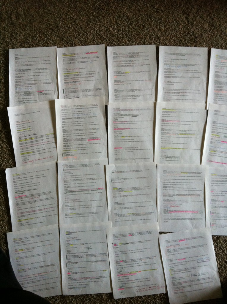
Some writers color code their manuscript to visualize things such as which characters are interacting and which major plot threads or subplots are involved. The colors show which things are spread too far apart or clumped together. Another method is to keep a summary of each scene on 3x5 cards and play with their arrangement. In my case I was working with a section of only two chapters so I used alphabet labeling. My arrangement switched from A thru G to A, E, B, C, F, G, D. Just make sure to get more Beta readers to verify the new version works.
 |
| Color-coded Revisions from Marissa Meyer - Check out her detailed article http://www.goodreads.com/author_blog_posts/4604630-subplots-character-arcs-and-color-coding-my-process-for-major-revisio?utm_medium=email&utm_source=author_blog_post_digest |
Some writers color code their manuscript to visualize things such as which characters are interacting and which major plot threads or subplots are involved. The colors show which things are spread too far apart or clumped together. Another method is to keep a summary of each scene on 3x5 cards and play with their arrangement. In my case I was working with a section of only two chapters so I used alphabet labeling. My arrangement switched from A thru G to A, E, B, C, F, G, D. Just make sure to get more Beta readers to verify the new version works.
No comments:
Post a Comment